25 best lead generation form examples optimized for conversion
A great landing page with a strong call-to-action is the first step to converting an anonymous web visitor into a known lead. But the web form they must then submit is a barrier that must be crossed before you can call them a lead. With the right tactics, you can create forms that not only alleviate the common concerns people have about sharing their information, you can actually excite them and generate more interest in what you offer. Check out these 25 lead generation forms with examples and learn why they are so successful at converting leads.
Best Lead Generation Form Examples:
1. Bounce Exchange
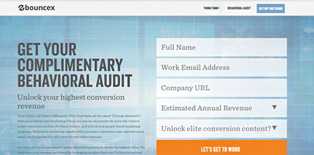
It’s important to place a button on your form that says something other than “Submit.” Replacing that wording with language around what it is you’re actually doing—in this case, getting to work—will more easily engage readers, which boosts conversion rates.
2. Unmetric
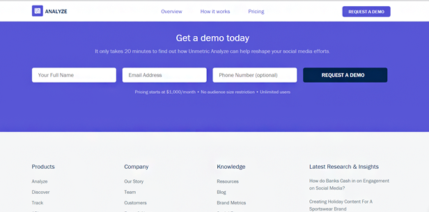
Try experimenting with a form that doesn’t actually look like a form. Even displaying your fields horizontally rather than vertically will shift the way the reader receives it, meaning they might not have the same guarded reaction they normally have when they see a vertical form.
3. Single Grain
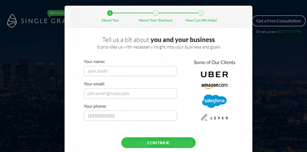
Including the names and logos of notable clients in your form can ease concerns and generate trust. If Uber and Amazon use this service, it must be legit, right? Probably so. Just make sure you have the permission of those clients to use their names and logos in that manner.
4. Square
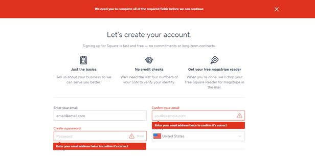
Be sure someone knows when they have left out a particular field in your form. This example makes that very clear, which is ok—it’s better to be sure than to let someone think they completed your form when they did not. Apply this to any lead generation form template you create.
5. Freckle
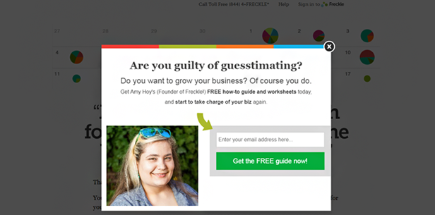
Using a popup for a form is a fine idea, but if you do, be sure to leave a clear path to the exit, such as the “X” in the top right corner of this example. Otherwise, if they are not ready to submit your form at that moment, they are likely to leave your site in frustration and never come back.
6. eToro
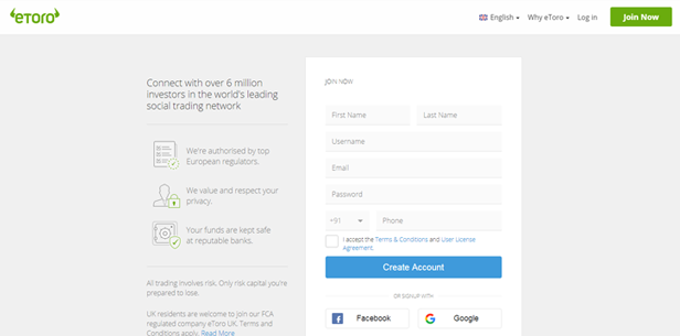
If you have the capacity to integrate with social platforms such as Facebook, Google Plus or LinkedIn, give your audience the ability to complete your form with information from those platforms. It saves them time and makes the form easier to complete, which is a top priority for lead generating forms with high conversion rates.
7. Spredfast
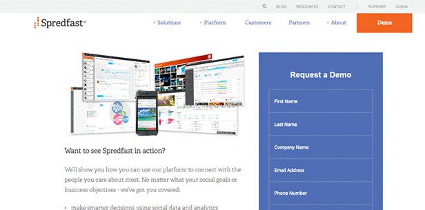
A form conversion that provides you with unusable information is essentially useless, as it makes it impossible to actually reach out to the person who completed your form. Put in place a mechanism that alerts the form submitter to any information that does align with the correct format, such as a partial email address.
8. Wealthfront
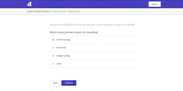
Formatting your lead generation form in a way that appears to be a series of survey questions rather than a traditional form can help increase conversions. This form takes you to a new page for each field you complete, capturing the same information but in a less invasive way.
9. SEMrush
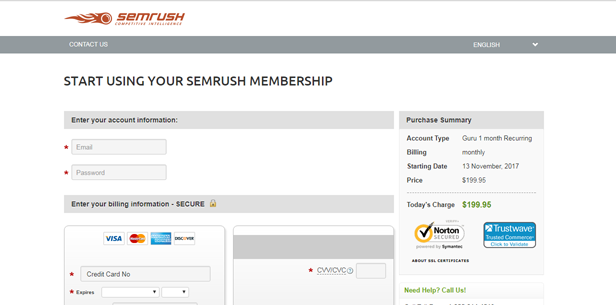
When you ask for credit card information on your form, it’s imperative you show your potential customer that they can rest assured the transaction is secure and their information is protected. Include logos of the data security certifications that your process has achieved.
10. Comparethemarket.com
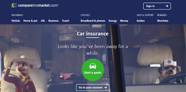
If your form has multiple parts, let the reader know by including a progress bar across the top. This tells them which section they are currently on, and how far they have to go before they complete the process.
11. Megalytic
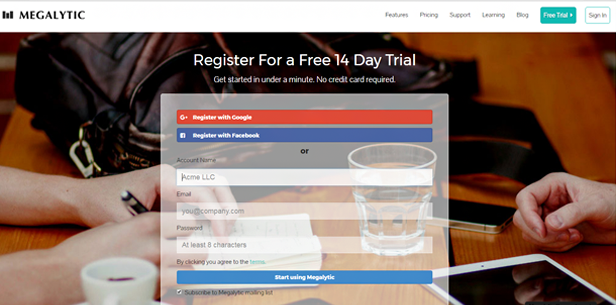
A form is a great place to add people to your mailing list for future lead nurturing. It’s also much nobler to let people opt into your email list than it is to take their email and send them unsolicited spam. Simply include a checkbox below the form and you’ll be surprised by how many people check it.
12. WordStream
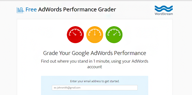
Do you partner with big name brands with positive name recognition? Consider promoting that on your form, as WordStream has done below with an icon around their Google partnership. It lends credibility and generates confidence that your product or service is solid.
13. Spiceworks
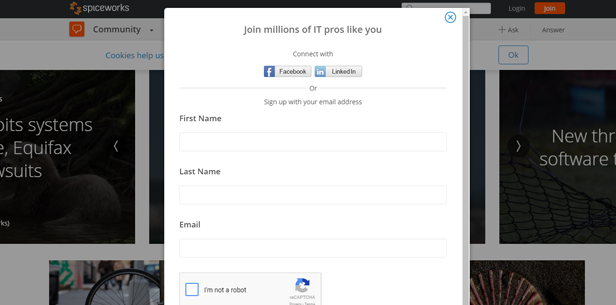
It’s always a good idea to include reCAPTCHA verification on your form if you have the ability. More form completions come from “robots” than you’d expect, so include some kind of verification method that confirms the person on the other end is a warm body, not a cold machine.
14. OpsGenie
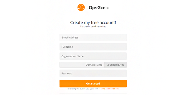
Form length is important, just like you’ve always heard. Having too many fields is bad, for obvious reasons. However, too few can create the impression that the service isn’t valuable. The sweet spot is between four and six fields, just like OpsGenie has done.
15. Unbounce
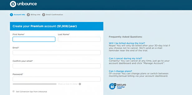
Many people will arrive at your form with unanswered questions. This may deter them from submitting. The best way around this is to offer FAQs alongside the form to cut through any uncertainty.
16. MuleSoft
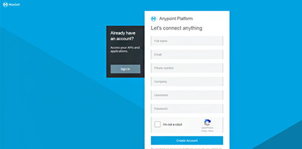
Take the opportunity to turn the copy on your form into a call-to-action of its own. Instead of saying “sign up,” use strong command language that describes what you are about to do. It’s much less boring and more effective at converting leads.
17. CampusTap
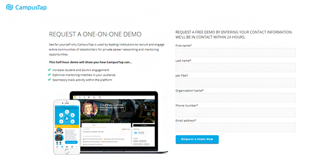
If your audience doesn’t realize that certain fields are required, they might complete the form, get it rejected, then lose interest and close their browser. Be sure to flag required fields with an asterisk.
18. Zendesk
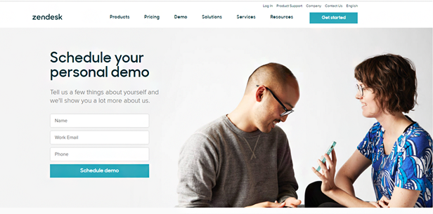
Use first-person language on your forms. The personal touch helps the reader imagine you are talking to them and helps them envision how your product or service will help them in their actual, real-world use case.
19. HelpScout
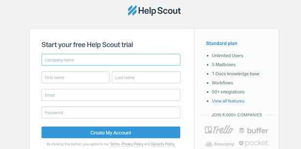
If you sell a service with different plans, it can be an effective tactic to include a brief list of bullets alongside the form that lists the features or offerings of that particular plan. Clarity is king with lead capture forms—if there is uncertainty, you will lose a potential customer.
20. SendGrid
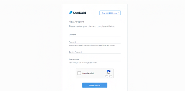
If any of your fields require special instructions or guidelines to complete, it’s helpful to include those as subtext below the field in question, or alternatively as a popup that appears when you hover over the field. This is most common with password requirements but can apply to virtually anything that needs explaining.
21. Plivo
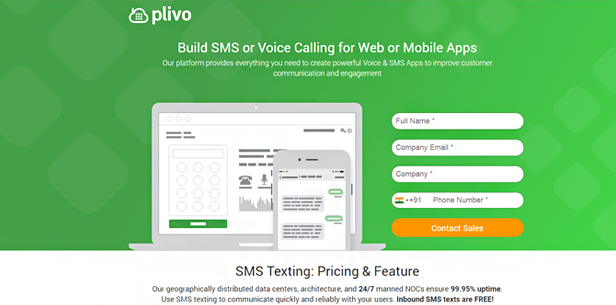
The directional flow of information on the page is important as well. In the west, we read from top to bottom and from left to right, so be sure to place your form in a place that the eye naturally gravitates to. Placing it on the left or at the top of your page could make your form feel out of place.
22. Zoho
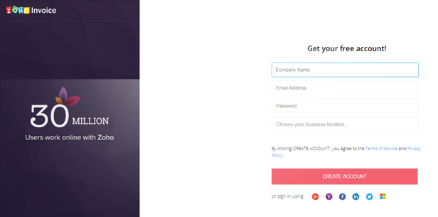
Filling out a form for a company that you are not familiar with can make you feel a little vulnerable. What are they going to do with your personal information? Allay these concerns by including a link to your privacy policy right on the form.
23. Tableau

One notable exception to the need to have sufficient fields on your lead generation form template is when you create a form for nothing more than capturing emails. This is helpful if all you want to do is add names to your database. You can send them longer forms later on, once you establish mutual trust.
24. Twilio
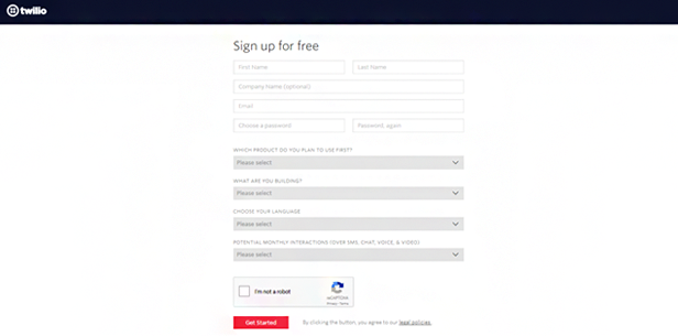
Don’t assume that because your form is the only thing on the page, you don’t need to worry about the submit button stand out. Give it a contrasting color so that it pops off the page. It’s a rule that applies across the board.
25. TeleSign
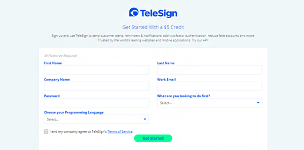
Including numbers on your form page is a great way to convince people to submit it. Use numbers to call out pricing, discounts, or promotional offers. The human brain is a curious thing—when we see cold, hard numbers we somehow feel more comfortable with the offer. Do this often.
14 Comments
Jayaraj Chanku
about 7 years agoHi Gabriel, Excellent post. Great list of forms. Thanks a lot for sharing this awesome post.
ReplyGabriel Swain
about 7 years agoThanks for the note, Jayaraj! I'm so glad to hear they were helpful! Cheers
Replyjeni
about 7 years agonice and interesting article about lead generation
ReplyGabriel Swain
about 6 years agoThanks, Jeni! I'm pleased you found this article helpful. Keep tuning in every week for new articles on emerging trends and best practices :-)
Replyvimal
about 7 years agoI am really happy with your blog because your article is very unique and powerful for new reader.
ReplyGabriel Swain
about 6 years agoThanks! It's encouraging to know we're providing valuable information. Keep tuning in, we always aim to educate and empower you to work smarter and generate better results! If you go to our blog home page (https://www.agilecrm.com/blog/) you can subscribe to our blog and receive articles right when they come out!
ReplyArifur Rahman
about 6 years agoThis post is very helpful. Thanks for your helpful post
ReplyGabriel Swain
about 6 years agoHi--so glad this post was helpful. That's our goal: to provide insights into trends and best practices that help you work more effectively and efficiently. We post multiple times per week so keep coming back each week to learn new trends and best practices for growing your business. Cheers!
Replykhyati makwana
about 6 years agowow great to share this information about lead generation ..helpful than you
ReplyGabriel Swain
about 6 years agoYou're so welcome! We're so glad you found this helpful. Cheers!
ReplyEliaz Hassan
about 6 years agoThank you for your notic
ReplyGabriel Swain
about 6 years agoThanks for your comment!
Replysiam
about 6 years agonice post
ReplyGabriel Swain
about 6 years agoThanks! Nailing the lead form is a critical part of lead generation. Good luck with your efforts!
Reply