How to use A/B testing to increase conversion rates
A/B testing is a tried and true marketing tactic to increase engagement and drive more conversions through your website. You can A/B test a number of marketing tactics, such as emails, landing pages, web forms, and more.
There are plenty of A/B testing statistics out there, but the bottom line is the same: A/B testing allows you to find the most engaging approach to a particular marketing tactic and use that to increase engagement and conversions.
Below, we’ll dig into some tips for increasing website traffic and conversions using A/B testing. But first, let’s cover some A/B testing basics.
What is A/B testing?

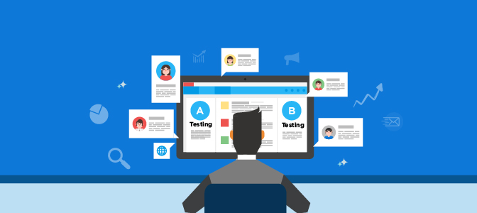
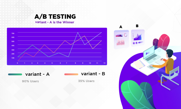
A/B testing consists of trying out two different approaches to the same marketing tactic (i.e., an email or a landing page) to determine which option works best for your audience.
Most reliable marketing automation (MA) systems will provide A/B testing tools to help you to uncover which tactics are working well for you and which are falling short.
You can A/B test the subject lines of your emails, the body copy, embedded images, and so on. Your MA system will send a sample of your email to two smaller sets of the overall targeted audience, then tell you which produced the best results.
Or, if you A/B test your landing pages, your system will send half of your audience to one version and the other half to the other version for a set amount of time. Then with the results, you can select the one that is producing more conversions.
A/B testing lets you hone in on the most engaging of two options so you can use that one to drive up engagement and increase website traffic.
Tips for effective A/B testing

Because you can use A/B testing on a number of marketing tactics, let’s cover some of the tips for using it on various marketing outreach touch points.
Email marketing
You can leverage A/B testing on various elements of your emails to increase conversions and drive more sales. Here are a few examples:
Subject lines
As mentioned above, A/B testing allows you to test two different email subject lines to determine which one produces the best open rates. If your email open rates are low, it’s probably time to A/B test some new subject lines. If no one is opening your emails, no one will read the awesome content you have inside, so be sure to A/B test to find the best style, tone, and length of your subject lines.
Email body
You can also use A/B testing on your email body copy. Once someone opens your email, what they find inside will determine whether or not they click on yourcall-to-action (CTA). If your click-through rates are low, you should consider A/B testing different body copy for a given email. It will increase click-through rates and drive more conversions on your website.
Images and videos
Images and videos in your emails can be highly engaging elements of your email marketing efforts. But if the images and videos you use are dull and unenticing, they won’t engage people in the way you want.
Try to test different videos or images for a given email to see which ones are engaging your audience. The more engaged they are, the more likely they are to click through to your website and convert.
Landing pages
There are various elements of your landing pages that can make or break conversions. Once someone arrives at your landing page by clicking the CTA in your email or social media post, the objective is to get them to take the desired action (in other words, to convert). A number of variables impact whether they convert, and here are a few:
Web forms
Do your web forms contain too many fields and ask for too much information? You’ll notice if this is the case because your conversion numbers will drop. Try A/B testing various forms with different data fields to identify those that ask the right questions. You’ll know that you’ve found the right recipe when conversions start to rise.
You can also experiment with the placement of your web forms. If you place your form on the right side of the page, does your form convert more leads? Or does placing it on the left side result in higher conversions? You’ll never know unless you A/B test both approaches to determine which one is more engaging and converting more leads.
Images and videos
Much like videos and images in emails, the visuals you place on your landing pages have a great impact on your ability to convert leads. Try not to use videos that are so engaging that they distract the viewer’s attention away from the CTA, which is ultimately the most important part of the page.
A/B test different images and videos on your landing pages to see which ones result in higher conversions. Again, you want to go for engaging, but not distracting.
Calls-to-action buttons
Your CTA button is normally embedded in your lead form. However, if you are not gating your offer with a form, your CTA button could go anywhere.
It needs to be highly visible. In fact, it should be the first thing that the viewer sees when they land on your page. If it’s not tied to a form, you can make your CTA button large and span half the page if you like.
It’s important that your CTA uses a color that helps it stand out and contrasts with the rest of the material on the page.
Additional A/B testing opportunities

You can use A/B testing on other elements of your marketing efforts. Here are a few to get you going:
Font sizes
Depending on your audience, some might prefer larger text on your landing pages and emails, while others may prefer smaller text. Although, viewers typically prefer larger text these days. But don’t make assumptions, A/B test font sizes to see which produce more conversions.
Font colors
Your font color will likely follow the stipulations laid out in your brand style guide. But that doesn’t mean you can’t mix it up to see if other colors work better. You should use A/B testing on the text color of your landing pages and emails to see which produces the best results for your unique audience.
Conclusion
The point of A/B testing is to experiment with different approaches to your marketing efforts and find the tactics that increase engagement, produce more click-throughs, and result in increased conversions on your website. You can learn more about the benefits of A/B testing here.
By following the tips above, you’ll be able to zero in on the recipe for success that will increase traffic, boost conversions, and grow revenue.

No Comments